Hot pink
#FF1493
Paint, graphic accents and black-on-pink highlights. Not white-on-pink body text.
First design review / 01
Review the homepage on desktop and mobile, the pink-and-black direction, and where your supplied logo proof appears. We’ll wait for your review before building the wider site.
The public homepage, its local sample-search interaction, this preview plan and platform practitioner sign-in. No booking, enquiry, payment, subscription or case-sharing submissions exist.
Open the homepage ↗01 / The colour story
Your supplied colours, with a black-and-white street-art spirit. Bold sans typography, square corners and intentional whitespace — not a serif salon look. Light appearance is intentional so this brand direction stays consistent.
#FF1493
Paint, graphic accents and black-on-pink highlights. Not white-on-pink body text.
#B9005D
Accessible buttons and links, paired with warm white.
#141414
Strong sans-serif headlines, text and graphic lines.
#FFFAF7
The main canvas. Space to breathe.
#FFF0F7
Soft section backgrounds that keep the pink story going.
Contrast: warm white on deep pink is 6.29:1; near-black on hot pink is 5.06:1. The Inter sans-serif fonts and portrait PNG are self-hosted by this app; no third-party font or image requests.
02 / Your identity, intact
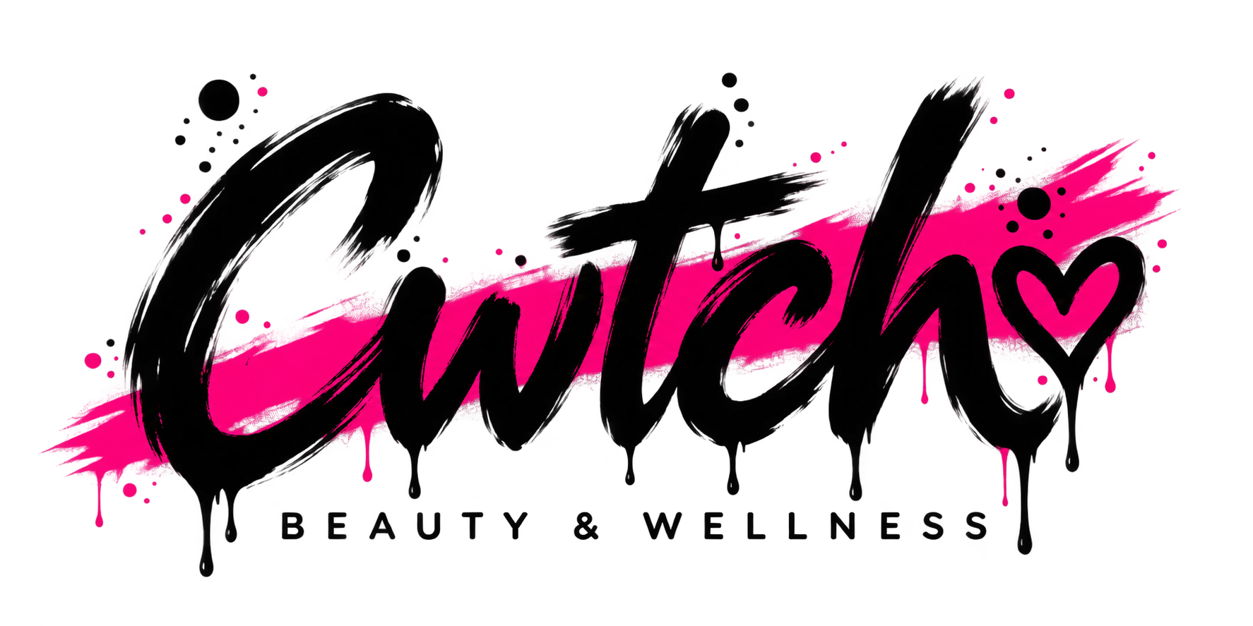
Your supplied logo proof is now in the header, footer and sign-in screen. The complete transparent PNG is unchanged: the black lettering, heart, pink stroke, drips and paint marks are exactly as supplied. It remains a proof awaiting final approval.
At the left of the navigation, kept compact on desktop and phone. The complete original mark retains its colours, composition and proportions.
A smaller repeat beside the footer links on warm white, so the original black lettering stays readable. No stretching, cropping, tracing or alteration.
The supplied reference composition stays complete: both people, the same 464 × 340 pixels, no crop, generated content or face replacement. A deterministic saturated-paint colour mask changes the painted accents to hot pink in a lossless PNG copy. All pixels outside that mask, and alpha everywhere, are identical to the original. The source stays unchanged.
Other approved photography is still needed. Until then, the treatment categories use typography, not substitute stock photographs.
03 / Page map
Everything below is a plan, not a set of working product routes.
04 / Separate ways in
Planned: apply to offer treatments, add evidence for review and build a profile after approval. This is separate from membership learning access.
Planned: tell Cwtch about a space and discuss rooms and availability. No enquiry form or submission has been implemented yet.
Taking bookings will not be a condition of learning access. The intended choices are below, but the sister-site membership specification has not been supplied. Entitlements, eligibility and billing remain draft; no prices or subscription actions are shown.
CliniShare is a planned treatment-based feature, not a connected service in this preview.
05 / Before the next stage
Check the homepage at desktop and phone sizes, the compact header, full portrait composition, colour choices and page map. Broader pages and real booking functionality wait for that review.
Back to the homepage